6 Things Everyone Should Know About Visualizing Research Results
15 Jan 2015
Welcome to your new team! We’re going to be working together for the next months and we hope you’re ready to do some great research. As you probably already know, the “main” function of research is:
def main():
  1. Figure out what we're going to do (planning),
  2. Do it (implementation),
  3. Understand what's been achieved (analysis),
     Go to step 1.
Q1: How many cycles through the loop?
You might be tempted to think that we will cycle through this loop just once or twice, that your colleagues are omniscient and know exactly how things will turn out, and that your job is to just implement things. That’d be wrong. We’re going to repeat this loop many times. In fact, the hope is that you’ll go through this loop every day, and that you’ll often go through the loop without everyone else’s knowledge.
You should think of the project as your project, and you should think of your colleagues and supervisors as people to bounce ideas off of, to provide feedback and additional perspective, and as a technical resource if you get stuck on something. But at the end of the project, it will be you in front of the audience, presenting your work, and defending the choices that were made over the course of the project. Make sure you believe in them!
Q2: How much time on each step?
You might think that step 2 is far and away the most important step, and that you will spend 95% of your time there. That too would be wrong. A more realistic balance would be 25% on planning, 50% on doing, and 25% on analysis. If you spend 95% of your time on step 2 then you probably haven’t thought hard enough about what it is you’re doing, and you probably don’t understand what you’ve done well enough. Put another way, a goal of our work should be to establish some more general principles beyond “Method A achieved B% accuracy on Dataset C under metric E.” Running experiments is good source of ideas, but we want to go a step further. If Method A did surprisingly good or bad, ask why.
Try to develop some hypotheses, and try to develop simple experiments that test these hypotheses or (if possible) mathematics to explain them (e.g., the mathematical form of Method A means that it will never simultaneously be able to do X and Y at the same time, which means its performance on Dataset C will always be upper bounded by 80%).
Q3: What are meetings for?
You should expect to leave meetings with a plan, but not a to-do list. The former gives you a few directions and stresses the importance of you executing the research loop. The latter locks you in a mentality of delivering a few “deliverables” and focusing only on step 2. If you’re consistently feeling like you leave meetings with to-do lists rather than plans, say something. If you don’t want to be confrontational, you can say something like, “I see the general idea here. I’ll go and run with it.” We will probably spend most of the time in meetings on Step 3, but that doesn’t mean that Step 3 is exclusively a group exercise. This is particularly important because sometimes doing a good job of Step 3 requires some additional plots or experiments that we won’t realize as valuable until we start trying to dig in and understand what’s happened so far. If you get in a habit of doing Step 3 on your own, you can preemptively produce these plots and experiments, which will impress everybody.
Why is this all important?
Why spend so much time on planning and analysis? Because doing a good job on them will lead to:
- Better communication of results,
- Increased research agility,
- Faster discovery of code and thought bugs, and
- Ultimately, higher quality research.
So to summarise: take responsibility for your project, iterate more, and iterate smarter.
Hang on, I thought this was about visualization?
It is! Making visualizations and plots is a key component of analysis, and interpreting visualizations is a key ingredient of planning. A guide that is about planning and analysis is a document about plots. (From hereon, we will use the term “plot” to also refer to any visualisation or illustration, something that shows us something visual so that we can make easy inferences from the data, and not from the raw data itself).
When making a plot, the goal is to communicate some point as clearly and cleanly as possible. This means making sure everything is labeled and clear, making sure you haven’t included things that will be distracting or deceiving, and it means thinking about how to best translate the point into visual form. Specifically, here are 6 things that every successful researcher will know about making plots:
- Plots are not the point (i.e. don’t waste everyone’s time)
- Your audience are not the X-Men (i.e. don’t make me have to read your mind)
- Your audience are (probably) not geniuses (i.e. don’t make me have to think too hard)
- What you don’t plot says a lot (i.e. don’t be deceiving)
- Plots are forever (i.e. don’t ever think you’re done with a plot)
-
Plots really are not the point (i.e. don’t forget the loop)
-
Plots are not the point (i.e. don’t waste everyone’s time)
1.1 For every plot that you make, think about the one sentence caption that explains why you are making this plot. Why is this a useful plot to look at? What are we going to learn by understanding what’s happening in the plot?
-
Your audience are not the X-Men (i.e. don’t make me have to read your mind)
2.1. First and foremost, use correct plot types for the data you are displaying and for the point you want to make. There are many good online resources about this. See e.g. this and this.
2.2. Label plots properly. Bad: 1) A plot with no labels. 2) x-axis: “Time” with no units. 3) y-axis: “Error” when it’s not actually error. Good: x-axis: “Time (sec)”, y-axis: “Estimated Mean”
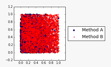
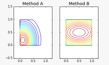
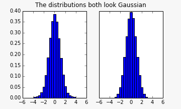
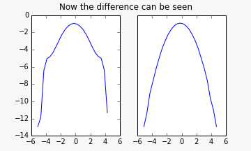
2.3. Make sure the plot is informative. Bad: Plot of samples from two 2D distributions with the same support (say [0,1]^2) but different distributions. So many samples that it’s a mess of points on top of each other. Good: Side-by-side contour plots, or a visualization of the differences.
2.4. Make effective use of space. Bad: 1) Super zoomed out plot, where all methods look the same. 2) Plot that spends 90% of space on noisy region where not much is to be gleaned. Good: Properly zoomed.
2.5. Use correct axis scales and ranges for visibility. Bad: Histogram from Matt & James showing participation. Good: Same plot using log y-axis.
2.6. Use correct axis scales and ranges for the point that is being made.
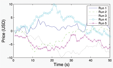
2.7. Don’t forget that some people are colourblind or they will print in black and white. Bad: Plot of two lines, one in red, one in green, no other distinguishing features. Also show in black and white. Good: Add markers.
-
Your audience are (probably) not geniuses (i.e. don’t make me have to think too hard)
3.1. Don’t make me do calculations in my head. Bad: You show a plot, and the viewer feels a need to pull out a calculator. Good: Anticipate what the viewer will want to calculate, and make sure it’s clearly displayed on the plot.
3.2. Avoid making a wall of plots. Bad: 100 page pdf with 6 plots per page. Good: Figure out what the point of those 100 pages are, and distill the point down to a few well-chosen plots.
-
What you don’t plot says a lot (i.e. don’t be deceiving)
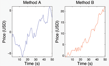
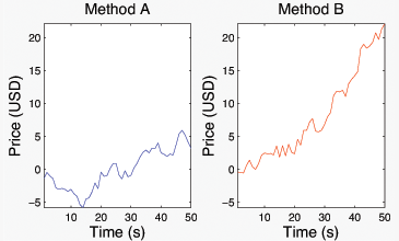
4.1. Avoid plotting non-comparable quantities together. Bad: Error vs iteration where iteration means something different for the different lines (e.g., an optimization algorithm that does line searches versus one that doesn’t) Good: Error vs # oracle calls or Error vs Runtime– whatever is the most meaningful way of reducing the execution of each algorithm to 1D in a fair way.
4.2. Don’t change axis ranges in side-by-side plots.
4.3. Explicitly label everything that is different across plots. Bad: 2 plots side-by-side, one showing train errors, one showing test errors. Both have Method 1 against Method 2, but hyperparameters of Method 2 are different in the two plots (e.g., neural net with 10 hidden units in one, neural net with 20 hidden units in the other).
-
Plots are forever (i.e. i.e. don’t ever think you’re done with a plot)
5.1. Make sure you are able to revist all previously made plots easily. Have it in your mind that we might say on week 10, “Remember that plot you showed us on week two? Can you update that to have a log-log axis, and add the new method that you just implemented to the plot?” This requires thoughtful organization, but it’s worthwhile for you to figure out.
5.2. Make sure you keep the data to be able to edit a previous plot.
5.3. Have plots that compare your most important plots across time.
5.4. Consider creating a merged plot if you find yourself putting two plots side by side more than once. Bad: Two side by side plots with different titles comparing a related quantity. Good: Merged plot where the two curves are labelled appropriately.
-
Plots really are not the point (i.e. don’t forget the loop)
6.1. It’s all too easy to forget that, as mentioned before, the point of plotting is to develop an understanding and to measure progress. Not to make plots.
6.2. If you see a surprising trend in your plot, investigate further! This requires changing your mindset after you have produced the plot. Once you are done producing the plot, your job is to interpret and understand the plot. Try to come up with an explanation for the trends. Try to explain the anomalies. If there is a small blip in one tiny region of the plot that seems interesting, make another plot that digs into it (and not necessarily just a zoomed-in version of the original). Try to summarize the point of the plot. If you’re not able to, it means you need to go back and try again. Maybe it’s just a small tweak in the axes that you need to make. Maybe you need to write a large chunk of code to pull out more detailed information about your method. Maybe you need to modify the method to not use some form of information and add that baseline to the plot. Surprise: A plot with an interesting anomaly in it. Resolution: Perhaps a 3D plot that explains the anomaly e.g. by way of the datapoint having been an outlier.
6.3. Although plots give you an indication of progress, be careful not to have a myopic focus on a single metric. Focus: Bar chart with system’s performance over time gradually increasing by some metric. Consequence: Bar chart with system’s performance gradually decreasing by some other unforseen metric.
6.4. Always take care to vary the salient properties of the system. There is an unspoken assertion when you produce a plot that what you are showing are illustrating the most important and interesting aspects of your method. Make sure this is true. Note that this means that you have looked at lots of other plots and decided that they were less important to show. Even if it’s inconvenient to show that your method doesn’t work very well on some metric, it’s still your responsibility to discover that and report it. Good: Plot showing all things look good under one setting. Bad: Changing one salient property of the system makes things explode.
Other things
- See Graphic Presentation (1939).
- Complete Tom Minka’s course on Statistical Graphics and Visualisation (2003).
- Read Patterns for Research in Machine Learning (2012).
Thanks to Dhruv Batra for comments and suggestions.